Submitted by Hans Snoop on Wed, 06/15/2016 - 07:32
On the dashboard, the displayed quotas bars are completly wrong (pls. pay attention to the attached image):
(a) 8,67 GB of 10 GB used ... and the bar is nearly complete blue
(b) 8,66 GB of 50 GB used ... and the bar has the identical layout as (a)
That's not very helpful.
Files:
Status:
Active
Comments
Submitted by JamieCameron on Thu, 06/16/2016 - 01:27 Comment #1
That's expected - the quota bars are scaled based on the largest domains' quota. You can change this using the "Configure this page" link on the right though.
Submitted by Hans Snoop on Thu, 06/16/2016 - 05:18 Comment #2
That's expected ?
[********==] = 8 of 10 GB used = 80%
[*****=====] = 4 of 8 MB used = 50%
The usage in percent has nothing to do with the largest quota, right ?
Submitted by JamieCameron on Thu, 06/16/2016 - 19:26 Comment #3
The size of the bar isn't (by default) the user's quota, it is the size of the largest quota. But this can be configured.
Submitted by Hans Snoop on Sat, 06/18/2016 - 06:23 Comment #4
May somebody pls explain me the sense of those quota display settings ?
I think (and most admins will agree) that i need an overview of how much available space for which user is used or not. so i can find out with one view, where i need to raise the quota or where i need to talk to the user.
for those i need a percentage of usage in comparison to total user space (pls. see my text-bar-example above). the width of the bar in total is 100% of the available space of that user/domain. the red part is the used space of that user/domain in percentage to the total width of the bar. so it is unimportant for me, if one user is using 80% of 10 GB or 90% of 5 MB ... the bar shows me directly, how much percent of the space is used.
i changed my settings and att. you'll find the new screenshot. even after refreshing the dashboard: the bars does not make any sense.
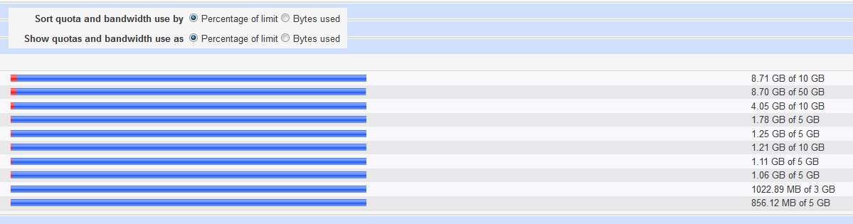
pls pay attention to the first two bars: both users are using 8,7 GB of their available space. but user (a) has 50 GB avaiable and user (b) has only 10 GB available. so, logically, the bar of the 2nd user should have much more of the red part as the bar for the 1st user.
(where can i att. a new image during editing this comment ??)
Submitted by JamieCameron on Sat, 06/18/2016 - 18:32 Comment #5
Basically, there are two modes which you can choose between by clicking "Configure this page" and changing the "Show quotas and bandwidth use as" option.
The "Percentage of limit" mode is what you want - each bar represents only the quota of it's domain. The alternative is "Bytes used", in which bars are scaled based on the max quota of any domain. This allows the red part (usage) to be visually compared between domains.
Submitted by Hans Snoop on Sun, 06/19/2016 - 08:16 Comment #6
Yes, i got that hint on your first already ... but it is not working.
unfortuanetly there is (or i am not finding) a way to attach an image. but i changed that setting of course, refreshed the page and the bars are not showing the percentage.
Webmin version 1.801
Submitted by Hans Snoop on Sun, 06/19/2016 - 08:17 Comment #7